Milestone 4: Evaluation
To conduct this evaluation, we had a member of our team go through the core tasks of the application and take note of issues encountered as they relate to the 10 heuristics we discussed in class. Our findings are discussed below.
Severity rating: 0
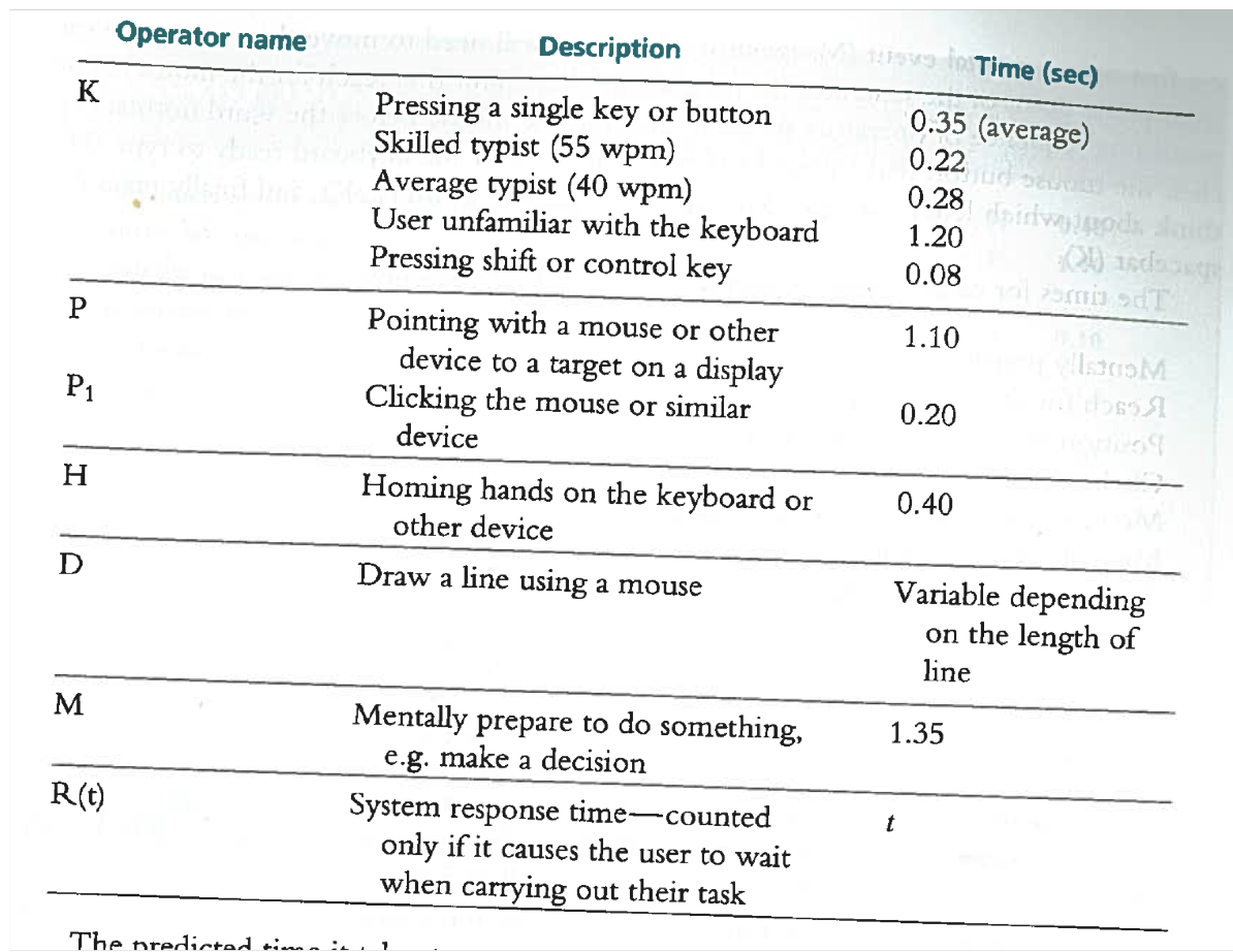
To conduct this evaluation, we used the KSLM Model to predict how long it would take the user to complete two tasks: Reporting a hazard and changing the map layer. We used the times from the following table, and used the average for pressing a single key.
Reporting a hazard:
Changing map layer:
These are relatively short times to complete tasks, and we believe that our design has enabled efficiency for the user. Changing the map layer could probably not be any shorter, but after evaluating the reporting task, it is clear that it could be 1.10s faster if the user did not have to scroll to below the picture before they start filling out the form. This is something to consider if we were to revise our design.
Cognitive Walkthrough:
As a user, my goal here is to use the web app when I go hiking to track my trail and mark the places where I spot an incident.
Goal: Track my trail (record & navigation)
Goal: Mark places where I see an incident
To conduct this evaluation, we had our team review the video recordings of a usability test with them present while asking the user to explain their behaviour during the test. The usability test consisted of two tasks: reporting a hazard and changing the map layer. The retrospective testing interview takes place in a quiet room with a TV, table, and notepad for note taking.
While watching the video recordings with the user, they seemed stressed. When asked about it, they mentioned that watching and hearing themselves on a video is strange to them. For reporting a hazard, the user takes a bit of time locating which report button to press. The user states that they were looking for the ‘hazard’ button and could not find it, so they clicked Obstruction using their best guess. Aside from that, the user mentions that it was easy to type in the kind of hazard with more information and was easily able to submit the obstruction with little hassle.
When presented with the video recording of changing the map layer task, the user takes a second to think about what a map layer is. The user informs us that they were unsure what the map layer was at first, but having it on the bottom menu bar helped them figure it out. Once they clicked the layer button, they understood what the function does and seemed to be less stressed.
To conduct this evaluation, we had a member of our team ask participants to user the prototype while speaking their thoughts out loud. The evaluation takes place in a quiet room with a table, the prototype, and notepad for note taking. The task they were asked to complete involved tracking their path and reporting findings along the way. In order to be able to complete this task in a static indoor environment, the thing the user “encountered” along the trail was described by the team member. The user was then asked to pretend that they had found them. Our findings are discussed below.
User #1:
56 yr old female. The user thought finding the button to record a track was easy to find, since it matched the wording she would have used to describe the action. When it was clicked, she commented on the smooth animation. There was no hesitation when the user clicked on “Start” to start the recording. When an obstruction (described as a broken bridge) was “seen,” she immediately found the report button. She was confused by the next screen, where she had to choose a category for the report. She was deciding for several moments between an “obstruction,” “detour,” and “trail conditions.” She tried to ask the test operator, but was told to try to complete the activity herself. She then chose “obstruction,” where she was able to fill out the information about this particular incident easily. Stopping the trail recording was also seamless, as she saw the stop option earlier.
User #2:
26 yr old female. This user initially tried to click “layers” when trying to find the option to record a trail before trying again on record. Since the record option is still visible in the layers menu, very little time was lost. When the broken bridge obstruction was described, the user just described what she was doing as she quickly clicked on the correct options to enter the details about the bridge. She was only confused if adding a picture was optional. Since we did not have a picture available, she quickly found out that it was.
User #3:
24 yr old male. The user had no problems at all using the system. He was able to find the options for starting and stopping the tracks immediately, and had no problems finding the menu and entering the information for the obstruction. He did not talk much during the experience since it did not take him long at all.
User #4:
20 yr old male. This user pretty quickly found the option for starting the tracks, but chose to look through most of the rest of the interface of the system to see what kind of options were available. Due to this, when he was instructed to enter the details about the bridge, he was quickly able to find the form. He was, however, slightly confused about the “How navigable” option, since he did not remember the exact description of the obstacle. After getting the information again, he still wasn’t sure which option to pick. He eventually picked “Not at all,” but wasn’t sure about his choice.
User #5:
21 yr old male. This user began with easily finding the record trail option. He commented that he liked seeing a “pause” option for things like lunch breaks or other rests. After the obstacle was described, he went straight to the report option. He was confused momentarily about which category to choose, but decided on “Obstruction.” He then was able to choose the type of obstruction, but had some difficulty deciding on the navigability, eventually deciding on “Not at all.” He commented that he didn’t know what the bridge really looked like, so he didn’t want to add comments in the description box. Stopping the trail recording was also straightforward for him.
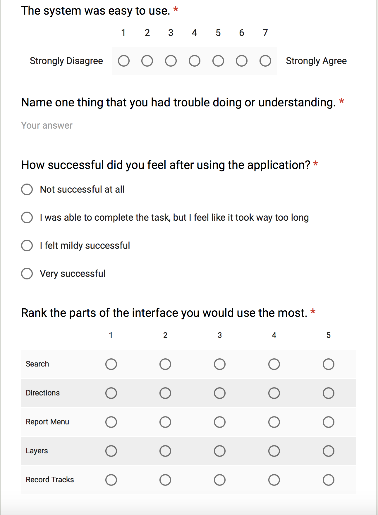
For the questionnaire, we first wanted to get some demographic information so we could see how participants of different ages, genders and experience with computers struggled with the system and what they liked. Next we asked how easy the system was to use overall, and had them rate it from 1 to 10, with 10 being very easy. We asked each participant for something that they struggled with, and left this open ended as it could have been very different for each of them. Next we asked how successful the participant felt after completing the tasks, because user sentiment determines how likely the user is to reuse the app or to recommend the application to their friends. Finally, we had them rank the importance of each feature. In our initial planning stages, we determined which features were most important to potential users. By asking this at the end, we can use the results to evaluate whether or not we designed the application in such a way that these needs were met.
Overall, the design of this application was successful. Through our analysis, we identified a few minor details that we would change if we were to implement this prototype. The first was the recording error discovered in the heuristic evaluation. While in the cognitive walkthrough, users did not have issues with this, however it could be confusing if there is no feedback provided when a user begins and stops recording a route. If the user forgets whether or not they began recording, they could mess up the recording. This is a visibility problem and will be resolved. To fix this issue we would add a little box in the upper right corner with a red dot that says “recording” to indicate that the application is recording the route. The second issue is that there are too many categories when reporting something. 40% of the participants struggled while deciding which category to place the broken bridge obstruction in. This error rate is too high and in the future we would provide fewer, more general options to make this choice easier. Adding an option like bridge/path obstruction would help solve this problem. Further, an “other” section where the user can describe the problem along with the picture will help cover for more obscure obstructions. Something we did really well was making all choices visible and available to users. None of the participants had problems finding the options necessary to complete their tasks. If we were to implement this prototype, we would keep the general layout of the application the same. We like the minimalist design and quick, user-friendly interface.