CSCI
1210
Economic Models – a brief overview
Introductory
Example:
In early
2003 President Bush proposed a massive, multi-year tax cut. He described this
proposal as a badly needed economic stimulus
package.
His political opponents in the Democratic Party
described the proposal as an unconscionable
giveaway to the rich.
Conservative commentators responded that these
criticisms amounted to class-warfare rhetoric.
How can we evaluate these claims? Is it possible to judge on the basis of
economic theory, or is this purely a subjective question of values?
Some
specific questions:
1.
How
much tax benefit will the average person receive?
2.
Will
the majority of the benefits go to rich, poor, or middle-class taxpayers?
3.
How
much will the tax cut stimulate the economy in the next year?
4.
What will be the long-term effects on
the economy and budget deficits?
5.
Is
it a good idea to stimulate the economy?
6.
Is
it OK if most of the benefits go to wealthy taxpayers, or is this unfair?
How we
answer these questions:
(1-2)
These are considered questions of fact;
we have confidence that they can be accurately answered using Government
economic statistics.
(3)
This is a projection using economic
models; it is fairly non-controversial
(4) This is also a projection, but
the models are controversial. It should be a question of fact, but it is not!
(5)
This is a value judgment, but non-controversial. Almost everyone agrees more
economic growth is good at this time
(6)
This is a highly controversial value judgment.
Some
interesting questions involving economic models:
1.
Effects
of medical cost inflation
2.
Average
income vs. income inequality
3.
Keynesian
vs. supply-side economics
4.
Cost
of mitigating global warming
5.
Future
of Social Security and Medicare
Effects
of medical cost inflation
In
recent years medical costs have consumed an increasingly large portion of our
total national income (Gross Domestic Product). Here is a worksheet for investigating this. Try these
scenarios:
1.
GDP
grows at 4.9% year and national health care costs grow at 7.4%
2.
Salary
grows at 2% per year and health insurance premiums grow at 7.4%
3.
Salary
grows at 2% per year and health insurance premiums grow at 10%
Click to see the full text of the US
government report from which these estimates are taken
Average
income vs. income inequality
Economic statistics are like a keyhole through which we view the vast complexity of economic data.

The
average is a simple linear model that tames the complexity of the real world.
Sometimes important details may be lost – see the “Inequality” tab of the
worksheet above.
Do
you choose to view income through the “average” keyhole, or try to see the
details? It depends on:
1.
How
much detail you can tolerate;
2.
Whether
you think inequality is important;
3.
Whether
you think the details help or hinder the point you are trying to prove.
Keynesian
vs. Supply-side economics
The
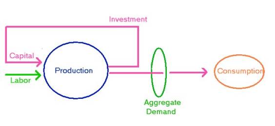
basic factors of production are labor and
capital. We will leave technology out of
this simple model.

Demand
is people wanting to buy stuff, which encourages producers to make it.
Two theories on how to increase production:
1.
Increase
aggregate demand (Keynesian economics,
after John Maynard
Keynes, 1883-1946)
2.
Increase
the supply of labor and especially capital (supply-side
economics)
How to
increase aggregate demand:
1.
Tax
cuts to people who will spend it
2.
Government
spending
How to increase
supply:
1.
Tax
cuts to people who will save it
2.
Eliminate
welfare, encouraging people to work
Which theory is more correct?
The
answer should be a scientific question, but in reality tends to be an ideological one! (People favor the theory that
best fits their political viewpoint)
Costs
of Mitigating Global Warming

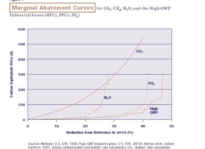
This graph from the report, Multi-Gas Contributors to Global Climate Change by the Pew Charitable Trust, deals with the marginal costs of reducing greenhouse gasses.

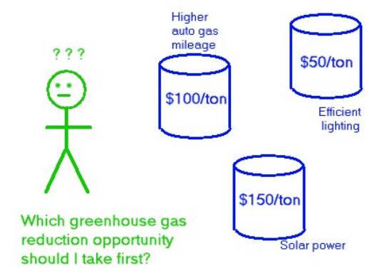
A ‘rational
person’ would pick the cheapest opportunity to save carbon first, then the next
cheapest, etc.
The marginal cost of the first batch of carbon saved: $50/ton
The marginal cost of
the second batch of carbon saved: $100/ton
The marginal cost of the third batch of carbon saved: $150/ton
n As Mr. Economic
Man is forced to choose more and more expensive opportunities, the marginal
cost goes up. Perhaps, it is better to choose some other gas besides C02.
n This “bottom-up”
model predicts a low cost for avoiding global warming. Other ‘top-down’ models
predict a higher cost.